Verge homepage redesign sparks mixed feedback
By Riley Hart
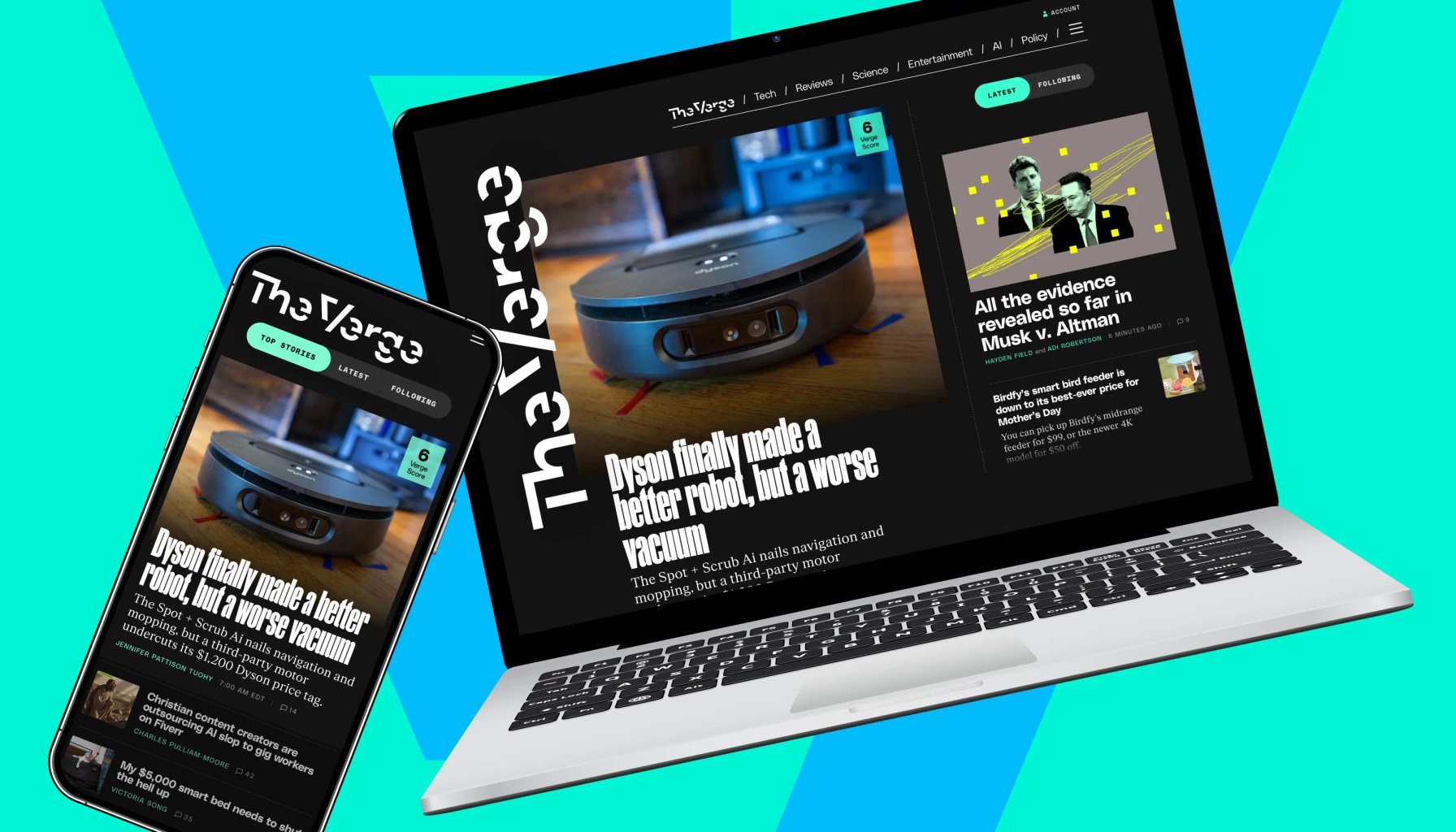
Image / theverge.com
The Verge’s bold homepage update drew a wave of feedback in a matter of hours. The outlet explains that it is sorting responses into clear buckets to separate fixes from broader experiments, signaling a surprisingly transparent approach to a design shakeup. This framing comes from the team behind the rollout and matters because it shows how editors plan to steer changes based on reader input, not just editorial whim. Verge product updates page
Bucket 1 is the practical payroll of the update: fix this, fix that. The Verge lists concrete items readers flagged as rough edges, such as the scrollbar on the feed, and notes fixes like adding a Read More option for groups of stories and offering a way to read more from a category toward the bottom of the page. In the update, the team confirms these fixes are in place, which is a reminder that in any large content heavy homepage small UI nudges can dramatically improve everyday readability. Verge product updates page
Bucket 2 is the branch of the redesign that many readers will watch closely: this is worth exploring. The Verge highlights requests they are still weighing, including how the Latest feed is presented for readers who love a pure revchron stream, and yes, dark mode is on the roadmap. There is also a note about dates on stories in curated sets, something the team removed to keep older items in circulation for timely topics, and an acknowledgment that the underlying tension between evergreen context and topical freshness remains unresolved. The article emphasizes that some of these questions do not have a one size fits all fix, and the team is actively thinking through options. Verge product updates page
From a practitioner’s lens, this is a textbook case of product teams using reader sentiment to triage work. First, it shows the value of distinguishing “bugs and rough edges” from “longer term experiments” in the same roadmap. It helps readers understand what to expect next and prevents cascading changes that destabilize the entire UI. Second, it reveals the delicate tradeoffs publishers confront: refreshing a homepage can boost discovery but risks confusing habitual readers who rely on a stable structure. And third, it underscores the strategic role of accessibility and aesthetics. Dark mode is not merely a cosmetic feature, but a usability pivot that can affect engagement across devices and environments. The Verge’s openness about the process is itself a signal that the platform is testing not just features, but how it communicates changes to its audience. Verge product updates page
Verdict: this is a careful, in progress refresh rather than a final overhaul. If you value a tidy, predictable reading surface and lack of surprises, watch for the dark mode rollout and the evolution of the Latest feed; if you want faster access to evergreen context, give the experimental changes some time to breathe. The Verge’s approach, transparent buckets, concrete fixes, and ongoing exploration, points to a redesign that will continue to evolve in public view. Verge product updates page
- What we’re hearing about the new homepageAccessed MAY 07, 2026
Newsletter
The Robotics Briefing
A daily front-page digest delivered around noon Central Time, with the strongest headlines linked straight into the full stories.
No spam. Unsubscribe anytime. Read our privacy policy for details.