The Home Assistant Dashboard I Actually Use Daily
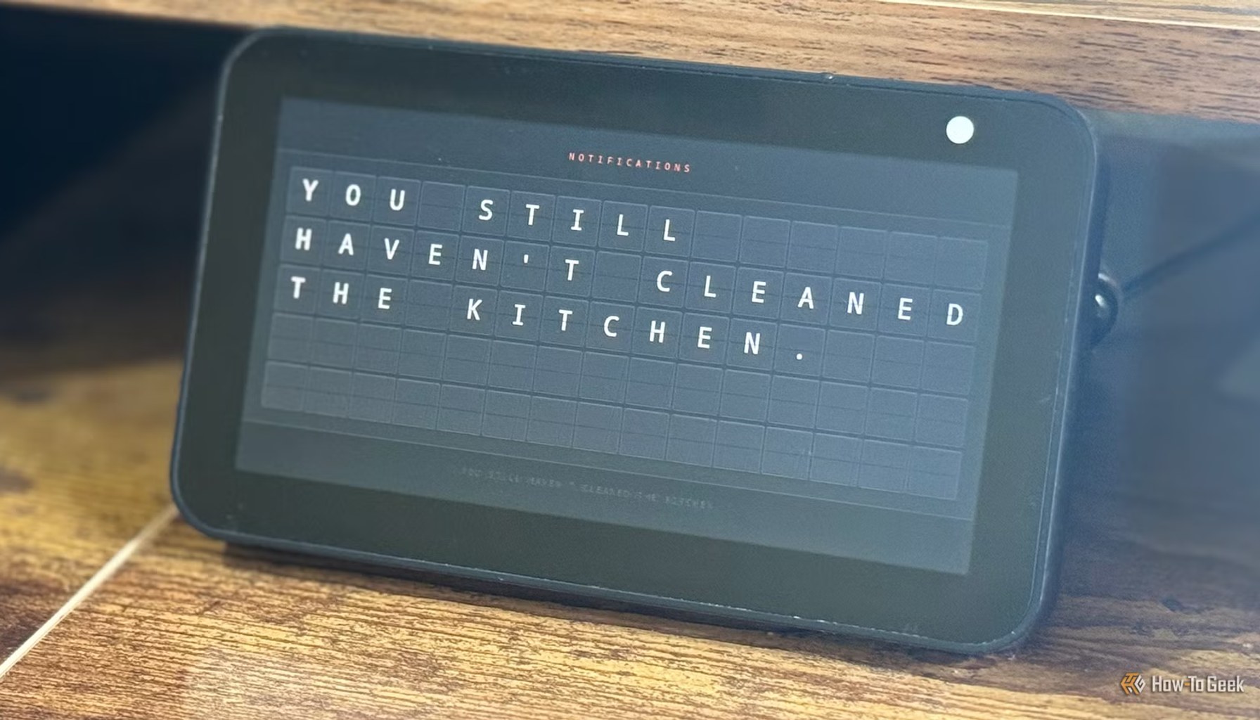
Image / How-To Geek Smart Home
The Home Assistant dashboard I actually use every day is shockingly simple.
In a world where many dashboards feel like cockpit simulations, the HowToGeek piece spotlights a setup that prioritizes everyday clarity over feature fatigue. The author argues that while plenty of Lovelace configurations look impressive, they can drown you in controls and data you rarely touch. What earns usage here is a minimal slate of essential tiles, laid out for quick glance, fast taps, and consistent habit. The result is a dashboard that feels like it was designed for real life, not a demo.
The takeaway is not that more features are bad, but that for daily routines you want less friction. The HowToGeek article frames the favored dashboard as one you actually enjoy returning to, day after day, because it minimizes clutter while preserving the core knobs you need, lights, climate, cameras, and a few glanceable status cards. It is a reminder that in consumer tech, usability often trumps novelty. The dashboard does not try to be everything at once; it curates what matters, and it does so with a calm, legible layout.
From a pricing and upkeep perspective, the narrative leans toward a no-frills, self-hosted solution. The core Home Assistant experience is free and open source, and the dashboard approach highlighted in the piece is built on that ethos. Total cost, for readers who already own the hardware to run Home Assistant, is effectively minimal. There is no mandatory subscription tied to the dashboard itself, and any paid cloud features are optional add-ons rather than prerequisites. For many households, that creates a favorable balance between control, privacy, and ongoing expense.
Still, there is a catch worth noting for shoppers and builders. A dashboard that is easy to use today can become a maintenance headache if you start layering a lot of integrations, automations, and custom cards. The more you tailor, the more potential updates can disrupt how things look or work. In other words, the very traits that make the dashboard approachable, its simplicity and reliability, also demand a discipline; you will want to prune, back up, and test as you expand. The article hints at this tension, presenting the dashboard as a curated tool rather than a sprawling control center.
From a practitioner standpoint, there are a few concrete takeaways that extend beyond this particular setup. First, a minimalist dashboard is not a compounding risk; it is a design choice that prioritizes reliability and speed, which pays off when you are waking up to check the home at a glance. Second, the choice between local control and cloud integrations matters; the more you rely on on-device data, the more you preserve privacy and offline resilience, but you trade some convenience and vendor support. Third, beware upgrade friction. A dashboard that looks clean today can require careful preservation of card configurations and themes during updates, so plan for backups and testing stages. Fourth, expect future evolution. Even a simple user interface benefits from modular components; you can swap in a more capable card or a faster layout while preserving the core workflow you love.
In short, the piece captures a rare moment of restraint that pays dividend in daily life: a Home Assistant dashboard that feels handcrafted for regular use, not for show. If you are shopping dashboards as a consumer, this example is a reminder that the best value is not always the one with the loudest graphs, but the one that helps you reach for your phone or wall panel and actually get things done with confidence.
- This is the Home Assistant dashboard I actually enjoy using every dayHow-To Geek Smart Home / Mainstream / Published JUN 12, 2026 / Accessed JUN 13, 2026